When creating an application, the details matter — from the content you include to the design and layout.
One of the most important yet often overlooked aspects is choosing the right resume font size. The option you select plays a crucial role in the readability and overall presentation of your document.
In this article, we’ll explore the ideal font size for resume, along with tips on how to strike the perfect balance between clarity and professionalism.


Why resume text size matters?
- Hiring managers quickly scan documents. A font that’s too small strains the eyes, while one too large appears unpolished.
- Proper sizing creates a structured, refined layout, making details stand out.
- Many companies use automated systems to filter applications. A well-sized font ensures your content is accurately processed.
- Optimized text allows key information to fit neatly on one or two pages without unnecessary gaps.
What should the font size be on a resume?
The best font size for resume depends on different parts of your draft, as well as the overall layout and design.
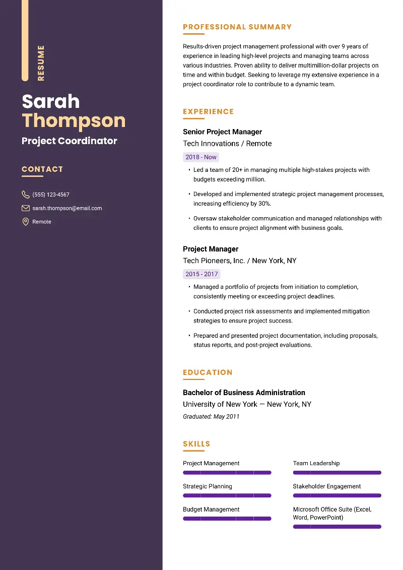
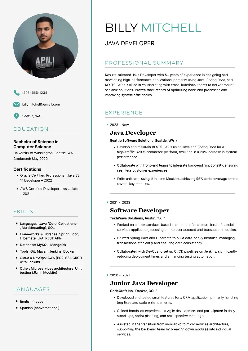
| Section | Standard font size for resume | Details |
|---|---|---|
| Name | 16–20 pt | Should be the most prominent text to be noticed. Using bold enhances visibility. |
| Headings | 12–14 pt | Titles like "Experience" or "Education" have to be slightly larger than body text. |
| Body Text | 10–12 pt | Main content, including job descriptions and skills. 11–12 pt ensures easy reading. Avoid going below 10 pt. |
What font to use for resume?
Here’s a deeper look into each font’s unique features and the industries where they work best:
Arial
Best for: General business, tech, marketing, customer service

Arial is a sans-serif font known for its minimalistic script. It’s one of the most commonly used fonts because it’s simple and highly legible.
The lack of unnecessary flourishes helps ensure your application looks clean, modern, and easy to digest. However, because it is so generic, it may not catch the eye in more imaginative areas where you may want to choose something with a bit more personality.


Calibri
Best for: Tech, healthcare, education, administration, and non-profits

As the default font in Microsoft Word, it is a popular choice. It is a progressive sans-serif font with rounded edges, making it visually appealing.
Its balanced and contemporary style fits well in administrative roles, education, and even non-profit sectors, as it conveys a sense of approachability while maintaining a professional look.


Garamond
Best for: Law, academia, publishing, literature, and creative writing

Garamond is a serif font that has been around for centuries, offering a timeless and sophisticated aesthetic. Its elegant, slightly condensed letterforms allow for more content to fit without appearing overcrowded, which can be useful for longer resumes.
The font adds an element of class without being too formal or rigid, making it ideal for roles where readability and professionalism are key.


Times New Roman
Best for: Law, government, academic, and certain corporate sectors

This is one of the most traditional serif fonts, long regarded as the standard for formal documents.
It exudes authority, which is why it’s often used in government applications. However, it’s somewhat outdated compared to other trendy fonts. So, for a resume, it’s important to balance it with a clean layout to avoid it looking too old-fashioned.


Verdana
Best for: IT, web development, digital marketing, and any tech-related fields

It was specifically designed for on-screen reading, making it a great choice for papers that might be viewed on different devices. Its wider letter spacing and clear, open typeface make it highly legible, even at smallest font size for resume. However, in more formal fields, it may not convey the same level of authority as some serif fonts.


Georgia
Best for: Digital marketing, journalism, media, and tech

Georgia is a serif font that combines tradition with modernity. It’s larger letterforms provide excellent readability. Its elegant yet accessible form makes it suitable for industries, where a mix of creativity and professionalism is essential. Its lines and slight flourishes give it personality.


Helvetica
Best for: Web design, marketing, finance, corporate sectors

It is one of the most popular and versatile sans-serif fonts in the world. It has a minimalistic typeface that gives off a sleek, contemporary vibe.
Helvetica's neutral look doesn’t lean too heavily in any direction, making it a safe choice for corporate settings. However, due to its widespread usage, it may not be the best option for highly creative positions.


FAQ on resume font size
- Can I use a smallest font size for resume to place everything on one page?
- While it may be tempting to shrink the font size to fit more content, it’s crucial to maintain readability. Using anything under 10 pt can make your CV difficult to read.
- Does the type of font affect the size I should choose?
- Yes, the typeface you pick can influence how large or small the text appears. Serif fonts like Times New Roman may appear smaller than sans-serif ones like Arial at the same point.
- How do I handle font sizes when submitting a resume online?
- It's best to use an online builder that automatically changes font sizes. This ensures your document looks professional across different devices and platforms without the need for manual adjustments.
Conclusion
In summary, selecting the right resume font size plays a pivotal role in how your information is presented.
Keeping the text within 10-12 pt ensures your content is legible and professional, while adjusting the size for section headings or job titles helps guide the reader’s attention.
Striking the right balance between clarity, structure, and space is key to making a strong impression.
Create your professional Resume in 10 minutes for FREE
Build My Resume